Content Editor (WYSIWYG)
The text editor, referred to as a WYSIWYG (What You See Is What You Get) editor, allows users to format text for webpages as they would in a word processor or document editor. Users can see and manipulate how the content will appear on a webpage without having to work with the HTML code. Any content type with a Text field (pages, events, and news items) will include editing tools for formatting and styling the content within.
The editor used in the portal system is supported on the TinyMCE platform. See the User Manual for information on the basic functions of the buttons and menu options on the toolbar as shown in the image below.
Best Practices when using the Editor
Below is information on best practices when creating webpages, including 508 compliance requirements. If you need other formatting options for your page, contact IMS for assistance.
For more details about web accessibility, read WebAIM's Web Accessibility Principles Quick Reference.
Alternative Text for Images
Images can be inserted into a page. Each image has a field for Title and for Alternative Text. The Title field can be left blank, but if a title is provided it will be shown when the pointer is hovered over the image (tooltip). The Alternative Text field should be filled to provide information about the image to the visually impaired.
Tips on Alternative Text:
- For purely decorative images there is no need to add alternative text.
- If the image already has a viewable caption, such as a person’s name, there is no need to provide alternative text.
- If the image contains a lot of detail, such as a graph, the alternative text should summarize what the graph is conveying. Details about the graph should be included in the text above or below the image.
Header Tags
Header tags provide structure to a webpage. Instead of using bolded or enlarged text, format the main topics of a page as headers to give an outline of the content. Furthermore, headers provide a meaningful sequence to users of assistive technologies and a good visual layout in general.
The header options are available in the Format drop-down menu. To change text to a header, highlight the text, click Format > Formats > Headers, and select the appropriate header tag.
Tips on Headers:
- The title of any content defaults to "Header 1", so headers in the content body should start with "Header 2".
- Nested headers or sub-headers should be in sequential order. For example, sub-headers of a "Header 2" should be "Header 3".
- Do not skip header levels. For example, do not add a "Header 4" under a "Header 2".
- If you need different styling for your header tags, contact IMS for assistance.
Structure Content
A good structure allows users to focus their attention on the key points of a webpage. Screen readers can also easily navigate the page. A good structure includes:
- Headers
- Shorter paragraphs
- Numbered or bulleted lists
Meaningful Link Labels
The text label for links should describe the content of the link target. Instead of using ambiguous labels such as ‘click here’, ‘read more’, or the actual URL of the link, provide relevant information such as the topic or purpose of the webpage connected to that link address.
Files
All files added to your site need to be 508 compliant. Section508.gov provides information on the 508 standards for documents. When you link to a file within the WYSIWYG editor, the file type and size will be displayed automatically after the link to provide information to users before they download a file.
Tables
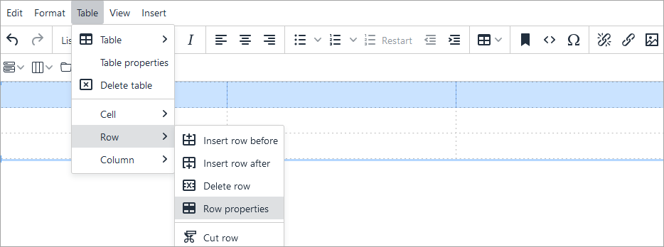
Tables should contain a header row and/or header column. To make the top row a header row:

Table formats are available in the Format drop-down menu. Select the table first and then click Format > Formats > Tables to find the following options:
- Listing – The default format with lines between rows only.
- Listing compact – Reduces the spacing between rows.
- Subdued grid – Adds gridlines between columns and borders around the table.
- Invisible grid – Removes all gridlines from the table.
- Striped rows – Adds a light grey background to alternating rows to improve readability.
Create Accordions Using the Editor
Accordions are useful for displaying a vertically stacked list of headers where each header can be expanded and collapsed to reveal and hide information within them.
- To create an accordion:
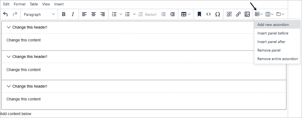
- Click the accordion icon on the editor toolbar and select Add new accordion.
- On the Accordion Picker dialog box, enter the number of panels for the accordion and click Ok. Each panel consists of a header and a body.
- The example pictured below has three headers and three bodies. Add content directly to the header and body sections.
- Click Save when finished.

- To add another panel:
- Click the accordion icon and select Insert panel before or Insert panel after.
- Add content to the header and body sections of the new panel.
- Click Save.
- To delete a panel or the entire accordion:
- Place the cursor on the header or body of the panel to be deleted.
- Click the accordion icon and choose Remove panel to delete the selected panel or Remove entire accordion to delete the whole accordion.
- Click Save.
Create Columns Using the Editor
Columns are useful for improving readability with certain types of documents like newsletters or flyers.
- To create columns:
- Click the column icon on the editor toolbar and select Add two columns or Add three columns.
- The example pictured below has three columns. Add content directly to the column sections.
- Click Save when finished.

- To delete all columns:
- Place the cursor on one of the columns to be deleted.
- Click the column icon and choose Remove all columns to delete all columns.
- Click Save.
Create Tabs Using the Editor
Tabs are useful for grouping a large amount of information into separate sections and allow users to easily switch between the sections without having to navigate to another page.
- To create tabs:
- Click the tab icon on the editor toolbar and select Add new tabs section.
- On the Tabs dialog box, enter the number of tabs and click Ok. Each tab consists of a header and a body.
- The example pictured below has three headers and three bodies. Add content directly to the header and body sections.
- Click Save when finished.

- To add another tab:
- Click the tab icon and select Insert tab before or Insert tab after.
- Add content to the header and body sections of the new tab.
- Click Save.
- To delete a tab or set of tabs:
- Place the cursor on the header or body of the tab to be deleted.
- Click the tab icon and choose Remove tab to delete the selected tab or Remove entire tab set to delete the set of tabs.
- Click Save.
It is possible to have multiple accordions, columns and tabs, and nested accordions and columns (tabs cannot be nested), but designing a layout with simplicity in mind will make the content easier to follow and navigate.
Create Mathematical Expressions
Available by request only, the MathJax application can be integrated in the editor to render TeX/LaTeX, MathML, and AsciiMath notations to mathematical expressions on your webpages. To add this feature to the editor, contact IMS for assistance.
To invoke MathJax, different delimiters are used depending on the notation format.
- TeX and LaTeX delimiters are
$$. . .$$or\[. . .\]for displaying math equations on a separate line, and\(. . .\)for displaying in-line equations. - MathML delimiter is
<math display="block">for displaying math equations on a separate line, and<math display="inline">or just<math>for displaying in-line equations. - AsciiMath delimiter is
`. . .`(back-ticks) and can be placed in-line or on a separate line.
Rendered mathematical expressions can be right-clicked to display the options to show or copy the formula in different notations as shown in the figure below.

For more information on working with TeX/LaTeX, MathML, and AsciiMath notations, see Writing Mathematics for MathJax.

